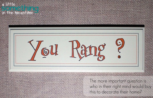
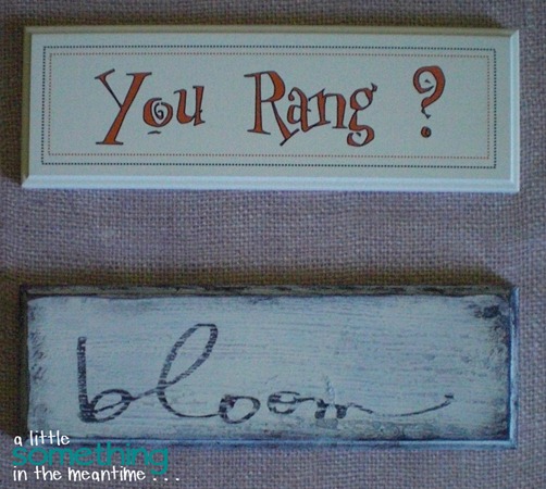
On Sunday, I decided to make over a clearance sign that I bought at HomeSense last year.
The end result is exactly what I wanted, but it took me two attempts to get there.
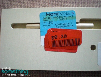
Like the title implies, I bought the sign for 30 cents (I actually bought 3 because I knew I couldn’t cut my own for that price).
The original price on the sign was $3.99, so I think I got a pretty good deal.
What I don’t understand is who they thought would buy this sign.
???
Anyway, last year at Winners I bought a wooden planter box with picket fence slats on it.
The colours used to weather the slats are so me.
This planter box will be the focal point of my mantel . . . when I finally finish it, so I wanted to add a little sign to the front of it that incorporated a spring or garden-related word.
I bought two different shape downloads for my Silhouette and also played around with my fonts using the words Grow and Bloom.
I cut stencils from contact paper and got ready to paint (I sanded the design off it earlier in the week).
I painted on a layer of black paint, let it dry and then painted over the word GROW with the same green that I used for my Grocery sign. After peeling off the lettering, I was left with this (sorry for the glare):
I hated it.
I thought I might be able to salvage it by painting over everything with white paint and then distressing it until the black letters showed through.
Wrong!
The tip of the g sanded right off.
It looked like it said crow instead of grow.
So, I sanded as much off as I could and started all over again with a completely different approach and word.
Before I had a blog to call my own, I sent a photo to the bloggers at aka Design to thank them for the tutorial that I used to create Christmas presents for my family. Shannon ended up sharing my sign in a reader feature.
I used the same technique for my second attempt.
For all the details, check our their step-by-step.
Basically, the order was black paint, antique white paint, crackle medium, stencil the word “bloom” in black then sand to distress it.
I was impatient and used a heat gun after each step to speed up the process. Next time, I would wait longer for the crackle medium to dry because the heat gun made it bubble.
So.
Much.
Better.
To give it an even more aged look, I added black paint to the edges and then wiped and/or sanded most of it off.
Now, the 30 cent sign matches the age and character of the weathered wood on my planter box.
If only I could finish decorating my mantel . . .
Linking up to these great parties as well as those on my Link Parties page!
Thank you to all the hosts!


I love this sign! But more importantly, what font did you use for bloom?
ReplyDeleteI love what you did with this sign - such a pretty color - its perfect now!! 30 cents???? - wow I would have bought a few too!! Have a great week! Heather :)
ReplyDeleteOh.. how pretty! Its goes perfect with the planter! And cant beat the price :)
ReplyDeleteWow...you scored a bargin! I love how it turned out...great job.
ReplyDeleteyou ended up with a great deal!!!
ReplyDelete