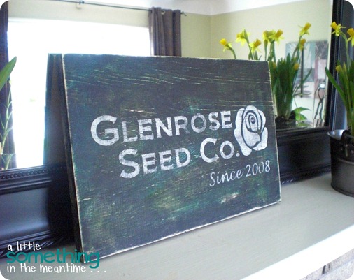
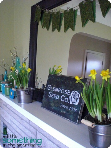
I’m back with the details on how I made my newest sign which is also the star of my revamped spring mantel.
After the daffodil incident, I decided that things needed to be shuffled around on the mantel. I wanted to add a sign or printable, but was coming up empty in the inspiration department.
Hours of Pinterest searching later, it suddenly dawned on me that I could have the best of both worlds – a sign that was both Spring-y and meaningful. Our street name is Glenrose and we moved here in 2008! FYI, I went with the ‘Glenrose Seed Company’ because it is too early for roses but not too early for planting seeds.
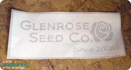
I designed the stencil for my sign in Silhouette Studio and cut it out using contact paper. After removing the unnecessary pieces, I applied a strip of clear contact paper on top of the stencil to transfer the placement of my letters and the rose.
Then, I got hung up again on the technique to use for painting my sign. I consulted my D.I.Y. Wall Art board and found this great tutorial from Funky Junk Interiors. 26 000+ pins can’t be wrong!
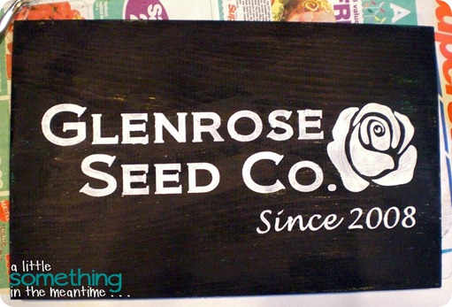
Using acrylic paint (black, white, turquoise and green) and a Dollar Store paintbrush, this is what I did to make my “old” sign from a new piece of pine board.
{Disclaimer: I did this project in my basement so the progress photos are far from stellar}
After I weeded my stencil, I was left with this.
You could see that my white paint bled under the stencil in places. That, and it just looked too new.
No worries!
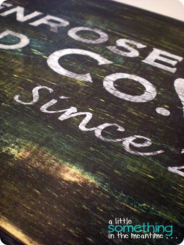
With a little TLC from my orbital sander and 220 grit sandpaper, my ‘new’ sign got a lot older.
After distressing, the turquoise and green that I used for my base coat peek through, imperfections from my stencilling are gone and the sign looks like it has been hanging outside for a few years.
If you are going to make your own sign, my two tips would be:
- Use a bristled brush, not a foam brush. Brush marks and uneven coverage are good.
- Paint the letters of your sign the same way that you would print them so that the brush strokes change directions.
Next time, I would like to try this with black text and a white background!
Do you have something that is meaningful to your family that you could incorporate into a sign?
Thanks for visiting!
P.S. Check out two other ways to make an ‘old’ sign here and here.
Linking up to these great parties as well as those on my Link Parties page!
Thank you to all the hosts!







Ohhhh.. cute! And thank you for the tutorial! I still havent busted out my silhouette.. maybe this weekend! Ive been eyeing some wood my parents have in their backyard. :)
ReplyDeleteBeautiful! I love the colors peaking through after the distressing. The perfect addition to the mantel. :)
ReplyDeleteKarah
i love your sign! i like that various colors are peeking through. i usually just stick with one base color, but i'll definitely try this on another sign.
ReplyDeleteClaire--I love your sign, the meaning behind it is super! You did a great job with the painting... I too love my CAMEO and some contact paper for a great cheap stencil! :)
ReplyDeleteYou saw my Rustic Wedding Signs, in that post was my "special" sign. Bushel and a Peck is the song I sang to my daughter as a child. It hangs in her former room which is now my guest room. (she'll be 30 soon) That song and sign are very special to me.
gail
Your sign looks fabulous - great job on the distressing! Thanks so much for dropping by my blog - Robert Munch is a favorite around here. The bins were purchased quite recently from Superstore - they are in the section with the kids decor. What part of Canada are you from? Hope you are having a great weekend!
ReplyDeleteJenn :)
Nice sign! Love the aging on it. I got a CAMEO for Christmas and I love it! I'm visiting from Creatively Living.
ReplyDeleteHave a lovely week!
Deborah
Love that sign! Looks really nice on your spring mantel!
ReplyDeleteThanks for sharing!
--Katie
@ Creatively Living
Hi Claire!
ReplyDeleteYour sign turned out great!
love it!
Amber
Lovely tutorial, will have to try one of my own. I have been wanting one for my kitchen, I just need to decide what it should say!
ReplyDeletehi, dropping by via Live.Laugh.Rowe! I love the sign you created and the distressing really made it look terrific.
ReplyDeleteGreat tutorial! I love the distressed look. Thanks for sharing at oopsey daisy!
ReplyDeleteLove the distressing and the meaning behind the sign. Great job!
ReplyDeleteThanks for sharing at simply Klassic!
I shared this lovely tutorial on my blog! I hope you will visit. Thanks for the inspiration!
ReplyDeletehttp://thesweetestmemoryblog.blogspot.com/2012/05/sweet-inspiration-amazing-and-thrifty.html
Kari
very pretty - love the colors you have peeking through from the bottom! yummy rustic goodness!
ReplyDeletewould love to have ya pop over for a visit anytime!
www.NorthernCottage.net