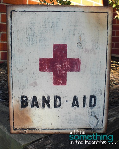
This weekend I did a quick D.I.Y. project that was both fun and served a purpose.
For almost 4 years we have had a nail in the bathroom above the toilet from where something was hung by the previous owners. I have mentioned before that we are terrible about hanging things up. Case in point.
My summer vacation officially started on Friday. That’s right, school only just finished this week in Ontario. I try to spend the first week of my summer restoring order to our house room-by-room.
Since Mr. Mechanic had to work on Saturday, I took this as an opportunity to tackle a much-needed bathroom deep clean. This seems to be the thing that I have to get out of the way when it comes to cleaning. Everything else is a much less involved process.
While cleaning, I smashed my wrist on the hand towel rail that is above the toilet. As I was standing there cursing, I once again noticed the lonely nail and thought “I really need to put something there!”
Our bathroom has a tricky colour scheme. So tricky that I bought the exact same shower curtain as what was there when we toured the house! The walls are a hideous cranberry colour and the accent colours (pulled from the curtain) are chocolate brown, yellow and a teal-ish green. Now you see why artwork was a challenge.
Last week I stumbled upon this lovely vintage-look First Aid sign when I was on Pinterest.
{Source: The Virginia House via Claire on Pinterest}
Living with a mechanic, I’m very familiar with all things first aid!
I could have painted a sign that said First Aid, but I decided to put my own twist on it.
A few months ago I found this vintage Elastoplast tin while going through a First Aid kit that I had in the trunk of my car.
With this in mind, I did a Google search for images of vintage Band-Aid tins (I’m a name brand girl – tissues will always be Kleenex and bandages are Band-Aids).
Which brought me to this lovely antique market find:
{Source: Sass and Peril via Claire on Pinterest}
Sorry. Inspiration hit me so quickly that I didn’t even stop to take photos of the process!
Here’s the gist of what I did:
I used the trace function on my Silhouette to create a stencil from the photo and then cut the stencil from an old overhead. I used painter’s tape to hold the inside pieces of the letters in place when I lifted it off the mat.
I wanted it to have an aged look when it was distressed so I consulted some of Lake Girl Paints’ amazing posts on how to create painted pieces with a lot of dimension and then got painting. My wood was just a piece of pine left over from my faux metal airplane artwork.
After doing a base layer using dark brown, mustard yellow and some black, I left it to dry and then painted over it with an antique white colour.
I sprayed my stencil with repositionable spray adhesive and then transferred it to my piece of wood.
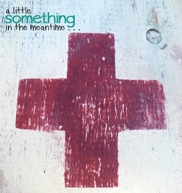
The cross was a mix of red, orange and black to make it a similar colour to my bathroom walls.
The lettering was painted black with a touch of blue. I think a really deep navy colour would have been perfect but I was working with the paint that I had on hand.
After this dried (courtesy of my hair dryer), I sanded it with my palm sander using 220 grit sandpaper. The layers of colour started to show underneath but it needed one more thing.
My original inspiration had a small frame around it and I remembered that Wendy had shared a trick for painting this in her Subway Art post. I didn’t have a ruler to sacrifice but I did have a piece of aluminum. I taped off a frame using Frog tape and then pressed the painted aluminum onto the wood. It worked, but since it was such a long piece of metal I switched to painting along the tape edge with a fine-tipped brush.
Then . . .
More distressing to age the freshly painted frame.
Paint the edges of the sign black.
And finally, ink the edges with Tim Holtz’ Distress Ink in Vintage Photo and smudge some of it onto the corners of the sign to age it further.
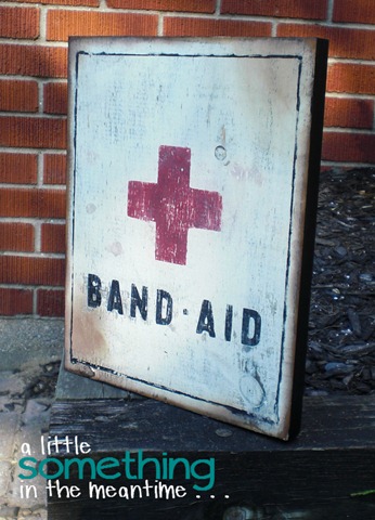
Voila!
It’s just what I wanted and it will be hanging in its new home tomorrow on July 8th (believe it or not, that’s a quick turnaround for me).
We had beautiful weather for Canada Day so I was able to do most of this outside on the patio. I was even able to write this post outside surrounded by the sound of fireworks.
One more day left of our long weekend – fingers crossed that we finish building a garden that has been in the works since Victoria Day!
Hope your first day of July was a good one!
P.S. Don’t forget to enter my giveaway for a chance to win a copy of My Memories Suite’s digital scrapbooking software!
P.P.S. Check out my other two ‘pinspired’ projects: Shanty 2 Chic's Mason Jar Planter Box and Sarah Ortega's Bird's Nest Pendants.
I link up at: Serenity Now, I {Heart} Naptime, Under The Table And Dreaming, Nifty Thrifty Things, Simply Klassic Home, Home Stories A to Z, Craftomaniac, Skip To My Lou, Not JUST A Housewife, A Bowl Full Of Lemons, Alderberry Hill, I Should Be Mopping The Floor, A Diamond In The Stuff, Creatively Living, The Winthrop Chronicles, Clean & Scentsible, Oopsey Daisy, Lil’ Luna, Someday Crafts, Live.Laugh.Rowe, The 36th Avenue, aka design,House of Hepworths, 52 Mantels, Thrifty Decorating, Crafty Scrappy Happy, How To Nest For Less, Tatertots & Jello, The Grant Life, It’s Overflowing, Lolly Jane, Too Much Time, Six Sisters’ Stuff, Positively Splendid, My {Re}purposed Life, 413 Sparrow Lane, Dragonfly Designs, Just Us Four, Liz Marie and The Crafted Sparrow
Thank you to all the hosts!


You definitely captured a worn and aged look. Such a great idea. Inspiration is everywhere, even in the trunk of your car LOL
ReplyDeleteI LOVE this! I love the vintage look of it--you nailed it! :) I'm following along now.
ReplyDeleteCute! It makes me giggle that the nail was still there from the previous people. I have found nails around our place too. But ours are in odd spots. Go figure!
ReplyDeleteLove your artwork though! Perfect for the bathroom :)
I love your sign Claire. It is aged to perfection!
ReplyDeleteI love brand name vintage!!! Great project, super fun. I found you at The Pinterest Challenge July.
ReplyDeleteHi there! Your sign caught my eye at the Homestories AtoZ link up. I absolutely LOVE it! Check out this project I did a few weeks ago - I run a feature called Pinspired and Produced and this was one of them! I'm really fond of the vintage Red Cross image. . . love the red and white. I've pinned that same inspiration piece too!
ReplyDeletehttp://breidawithab.com/pinspired-and-produced-8/
glad i found you - i'll follow along!
breida
Oh Claire! This is amazing. So vintagey and artful-all at the same time! It is the perfect thing to hang in a bathroom - where are the scrapes and owies are cleaned and bandaged. My kids love it, too. They want one. Now. I might be following your lead on this one.....
ReplyDeleteI loooooooooooooooove this! Awesome job!!
ReplyDeleteThis turned out great Claire! I love how the border turned out (thanks for mentioning me in your post!!) and the distressing. Fabulous!! Each time I read about you using your Silhouette to create such wonderful projects it makes me want one that much more! Did you get it hung up?!
ReplyDeleteEnjoy your evening!
Wendy
This looks great! I want one! Visiting from Someday Crafts link party!
ReplyDeleteWow that looks amazing! You did a great job at the distressing!!
ReplyDeleteThank you for sharing your ideas with us on Whatever Goes Wednesday. We featured your project tonight on the blog. Please stop back in and grab a featured at Someday Crafts button for your blog. Thanks for the inspiration!
ReplyDeleteCongrats on being featured at Someday Crafts! I saw your project there and was super-excited for you and I loved this project AND had to tell you that I LOVE the watermark on your photos! So fun and such cute fonts! : )
ReplyDelete-Mel the Crafty Scientist
Hello Claire,
ReplyDeleteI linked at a party right below your sign and had to come tell you how cute it is. And appropriate - my link was a first aid kit!
Pinning it.
~Bliss~
I love this sign Claire!! The aging looks fabulous. Thanks so much for coming out to the party at Clean and Scentsible. I'll be featuring this on Sunday. Hope the rainy downpour has stopped out your way. We finally have sunshine here! {of course right when I am leaving! lol!} Have a great weekend!
ReplyDeleteJenn :)
This is an amazing idea. I might have to borrow it. :)
ReplyDeleteI like how you took an inspiration photo but then totally made it your own. What a fun vintage-look sign!
ReplyDeleteThis is so clever!! I love everything about it! You did a really great job! :)
ReplyDeleteI need something for the awkward spot in my bathroom. I would be all for doing this because it's such a great idea for a bathroom. You aged yours so well!
ReplyDeleteLiz
I love it! great job!
ReplyDeleteLove your artwork - you'd never believe it wasn't an authentic old advertisement piece!!!
ReplyDeleteI'm your newest follower - would love you to visit and follow back
Hugs,
From Montreal!
Thanks so much for sharing this at TheWinthropChronicles.com, this will be featured tomorrow!
ReplyDeleteThanks so much for linking up to Ta-Da Tuesday! You are being featured at Unrefined By Design! Hop on over and grab a button tomorrow at this weeks party! :) Also, notice our name has change from 413 Sparrow Lane to Unrefined By Design, I'd be delighted if you would continue following by subscribing to the new blog!
ReplyDeleteBlessings~ Misty
This turned out really great! Thanks for linking it up to the Pinworthy project Party.
ReplyDeleteI wanted to stop by and let you know that you were featured today! I hope you will come check it out!
LOVE IT!!!! Thanks for sharing. One day I will get around to painting a vintage looking something.
ReplyDeleteYou will be featured tonight at this week's {nifty thrifty sunday}!
ReplyDeleteThank you so much for linking up!
xo! Vanessa
This is great! You did a fantastic job. :-)
ReplyDelete