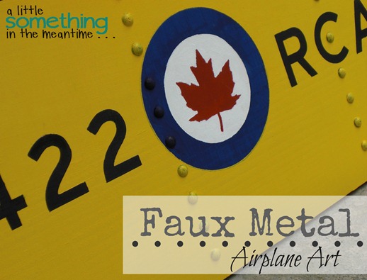
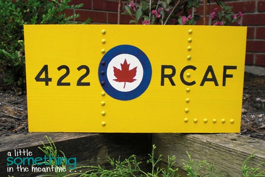
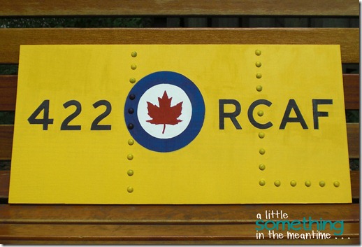
Today I’m finally sharing how I made this faux metal sign for my Dad’s birthday along with the meaning behind it.
My Grandpa flew a plane in World War II. One of the planes that the pilots and navigators learned to fly on was a Harvard Aircraft. They were brought to Canada to learn to fly and then returned to England.
One of the things that my Dad has always wanted to do is fly in an old plane. About two years ago, he bid on an auction for a flight in a Harvard and won. A few months later when the weather warmed up, he was able to cross this off his wish list.
I can remember him describing the flight and it was definitely a once-in-a-lifetime experience.
With his birthday fast approaching, I decided that I wanted to make him something to remind him of this special day.
With a little detective work, I was able to find out the number of the plane that he flew in for his flight.
{Source}
My Mom (aka my detective) checked the photos and confirmed that his plane was labelled 422 RCAF (the above photo is the opposite).
With that, I got to work!
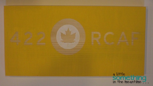
I created my design in Silhouette Studio and then used my Silhouette CAMEO to cut out my stencil or mask using Contact paper. I tried several other methods, including vinyl, but this is what ended up working for me.
My first layer of paint was the yellow background. I used Martha Stewart acrylic paint in Pollen. I already owned this from when I attempted to paint my office chair.
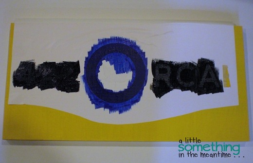
Once this was dry, I covered the yellow with the negative of my Contact paper mask so that I could paint the black and the dark blue.
This was my first mistake (if you don’t count the fact that I absentmindedly painted right across the white surround of the maple leaf with my blue!)
Since I used an opaque stencil mask, I couldn’t see if it was lined up exactly with the design underneath.
It wasn’t.
The colours bled.
Usually this would be fine because I distress most of my signs. I couldn’t fall back on distressing this time because my airplane panel needed to be solid yellow.
I bought a package of fine-tipped paintbrushes from Dollarama and touched up what I could. I used painter’s tape on the straight lines but that still left some gaps and imperfections.
Mr. Mechanic kept telling me “your Dad will love it” but I think that was just to appease me!
It needed to look much better. I knew it wouldn’t be perfect, but I wasn’t about to give up!
Here’s where I got creative.
I’m a teacher. Teachers use overheads. Overheads are transparent. A transparent mask means that you can see how your stencil lines up with the image underneath.
Silhouettes just happen to have an acetate cut setting.
AWESOME!
I cut out the RCAF symbol using an overhead and then sprayed it with repositionable stencil adhesive. This allowed me to touch up the maple leaf and circles without having to worry about the colours underneath.
Since I used acrylic paint, I was able to keep adding more layers of paint until I was happy with the finish and coverage.
The maple leaf is still a bit wonky, but now I know not to cut out such an intricate design and expect crisp lines.
At this point, my sign was painted and I could have stopped there but I wanted it to look like a metal panel, not like a wooden sign.
Then, I remembered that I had seen this faux metal sign idea on Pinterest that used upholstery or thumb tacks.
I consulted several photographs of Harvard planes to determine where I should add my rivets.
Before hammering them in, Mr. Mechanic suggested that I stick something onto the sign to map out my design and also to make sure that I did actually want to add the tacks (he’s so clever!).
I cut polka dots out of black vinyl (or, my Silhouette did) and stuck on my design. This helped me see that there needed to be rivets on both sides of the sign, even if they weren’t symmetrical in their placement.
We used the polka dots as a guide for where to hammer the tacks. I pushed one into the middle of each polka dot and then Mr. M hammered them in properly.
I can’t remember what it was, but I know he used something to prevent the hammer from denting the tack and the wood.
The last step was to paint each tack with the matching paint. I planned the arrangement so that I would not have to worry about painting two colours on the same tack. The paint did not completely cover the black, but I liked it that way.
With that, my vision became an even-better-than-I-imagined reality.
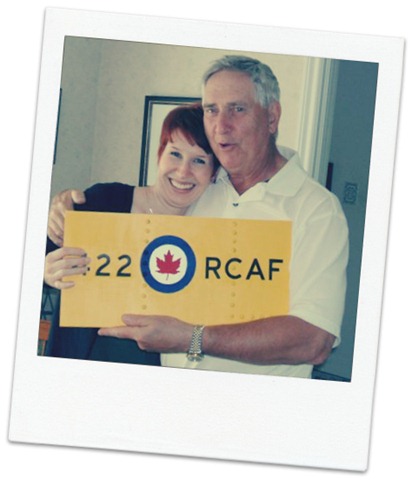
And, as you saw here, it was a hit with my Dad!
Do you have any men (or boys) in your life that might like some faux metal artwork? I know one bedroom where this would be perfect!
Have a great weekend – Happy Father’s Day to all the Dads out there! (I’ll be celebrating with Mr. Mechanic Senior)
P.S. Check out two more of my painted signs here and here! See what I mean about distressing?
I link up at: Serenity Now, I {Heart} Naptime, Under The Table And Dreaming, NiftyThrifty Things, Simply Klassic Home, Home Stories A to Z, Craftomaniac, Skip To My Lou, Not JUST A Housewife, A Bowl Full Of Lemons, Alderberry Hill, I Should Be Mopping The Floor, A Diamond In The Stuff, Creatively Living, The Winthrop Chronicles, Clean & Scentsible, Oopsey Daisy, Lil’ Luna, Live.Laugh.Rowe, The 36th Avenue, aka design, House of Hepworths, 52 Mantels, Thrifty Decorating, Crafty Scrappy Happy, How To Nest For Less, Tatertots & Jello, The Grant Life, It’s Overflowing, Lolly Jane, Too Much Time, Six Sisters’ Stuff, Positively Splendid, My {Re}purposed Life, Just Us Four and The Crafted Sparrow
Thank you to all the hosts!









Claire your sign is awesome, Thanks for the tutorial. We are off to Ingersoll (near Cornwall)to participate in a Relay for Life.
ReplyDeleteAwesome Claire! No wonder your Dad loved it. He could obviously see how much hard work you had put into it! Where is it hanging? I bet it's where EVERYONE can see it. That way Dad can tell everyone YOU made it (proud papa!) and he can tell the story of his flight.
ReplyDeleteThis is fabulous!! The rivet treatment really makes it. Love, love this! Thanks so much for your sweet comments on my blog; gotta love us some Canadian content! :)
ReplyDeletewow..that really looks like metal. what a sweet gift.:)
ReplyDeletekiki
www.kikicomin.com
Luv, luv,luv this sign Claire!! What a wonderful job you did making it, love the colors and the rivets you added! Thanks for linking up my Teen bedroom too! It would look amazing there!! I am sure your Dad was thrilled with his gift!!! Heather :)
ReplyDeleteWhat a great graphic. I'm really into bold graphic artwork and ya got it dear! Thanks for the eye candy.
ReplyDelete